Back
Why Do Students Miss the Library Map? A Study on Usability
Published Dec 25, 2024 • 6 minutes read
UX Research
Usability Study
LibraryTech
WebNavigation
Published Oct 11, 2024 • 6 minutes read
As a grad student, I joined a team of five to tackle an overlooked gem on Indiana University’s library website: The Map! 🗺️ Most students didn’t even know it existed, let alone how to use it. We set out to uncover why this tool was flying under the radar.
Starting Point
Starting Point
Ever felt lost while navigating a library? We did too!
We dove into the usability of Indiana University’s library maps, uncovering that only 20% of users could find them on their own and a low SUS score of 58.5. This case study explores how we identified key issues and proposed design solutions to create a smoother experience for students.
Ever felt lost while navigating a library?
We did too!
We dove into the usability of Indiana University’s library maps, uncovering that only 20% of users could find them on their own and a low SUS score of 58.5. This case study explores how we identified key issues and proposed design solutions to create a smoother experience for students.
Lost and Found: Mapping Out Usability Challenges
Lost and Found:
Mapping Out Usability Challenges
We set out to uncover usability issues with Indiana University library maps. The maps are essential, but finding them? Not so much! Even we got lost, proving they’re in dire need of a discoverability upgrade.
We set out to uncover usability issues with Indiana University library maps. The maps are essential, but finding them? Not so much! Even we got lost, proving they’re in dire need of a discoverability upgrade.
Test with Real Students
We wanted to see if the library maps actually worked for students. Could they use them to find resources easily? Testing with real users helped us figure out if the design hit the mark or if tweaks were needed to make it more user-friendly
We wanted to see if the library maps actually worked for students. Could they use them to find resources easily? Testing with real users helped us figure out if the design hit the mark or if tweaks were needed to make it more user-friendly
Uncovering Friction Points and Confusion
The focus was on identifying pain points students faced while using the library maps, zeroing in on two key areas:
The focus was on identifying pain points students faced while using the library maps, zeroing in on two key areas:
Awareness & Discoverability
Struggles here highlighted the need for a more visible design.
Were students able to find the maps easily?
Struggles here highlighted the need for a more visible design.
Were students able to find the maps easily?
Readability & Usability
Understanding these challenges pointed to areas for design improvements.
Once located, were students able to read and navigate the maps effectively?
Understanding these challenges pointed to areas for design improvements.
Once located, were students able to read and navigate the maps effectively?
A Heuristic Look at Library Map
A Heuristic Look at Library Map
Heuristics
Violation
Severity
1. Visibility of system status
The map is like a game of hide and seek—tucked away under the "UL building" and hidden behind three clicks.
It should be front and center, not buried and hard to find!
High
2. Match between system and the
real world
The map’s fixed orientation makes it tough for users to navigate based on their own perspective. Newcomers especially might feel lost.
The language used in the map should be more user-friendly, matching how people think, not just the system’s terms.
Medium
3. User control and freedom
Once a level is selected, there’s no easy way to return to the main map.
It’s like playing a game where the exit door keeps moving. A simple “home” button would solve this!
Medium
4. Consistency and standards
The map feels all over the place with inconsistent fonts, buttons, and styles. It’s like mixing up different puzzle pieces—it’s hard to follow.
A unified design would give users a smoother, more cohesive experience.
High
5. Error prevention
When something doesn’t work, there’s no feedback—just silence. Users are left guessing what went wrong.
A little notification or alert would save a lot of confusion!
High
6. Recognition rather than recall
Remembering which map level matches which part of the building is like solving a puzzle without a guide.
Clear labels and color-coding would help users instantly recognize where they are.
Medium
7. Flexibility and efficiency of use
Frequent library-goers have to click through each map layer, wasting precious time.
A shortcut or quick access feature would make their experience way more efficient.
Medium
8. Aesthetic and minimalist design
The map is visually overwhelming, packed with so many details that it’s hard to focus.
Streamlining the design would help users zoom in on the essentials without feeling lost in clutter.
Medium
9. Help users recognize, diagnose,
and recover from errors
If a user clicks on a wrong area or can’t find a map, there’s no feedback. It’s like getting lost without a road sign.
Adding alerts or error messages would make it easier to navigate.
High
10. Help and documentation
For new users, the map is a maze without a guide.
A simple tutorial or help section could make a world of difference in helping them navigate the site with confidence.
Medium
Ground-Level Insights: Real Impact
Ground-Level Insights: Real Impact
Participants
Participants
We focused on graduate and undergraduate students aged 19-29—the core users of the library.
We focused on graduate and undergraduate students aged 19-29—the core users of the library.
Library Map Testing
Session Overview
We started with a quick intro and encouraged participants to think aloud as they navigated the tasks, sharing their thoughts and feedback in real-time
We started with a quick intro and encouraged participants to think aloud as they navigated the tasks, sharing their thoughts and feedback in real-time
Task Execution
Participants tackled four tasks—finding locations and sections on the map. This helped us see how quickly and easily they could get around and what their experience was like.
Participants tackled four tasks—finding locations and sections on the map. This helped us see how quickly and easily they could get around and what their experience was like.
Think-Aloud Protocol:
As they worked through the tasks, users verbalized their thought process—what was working, what wasn’t. It gave us invaluable context and insights into their challenges.
As they worked through the tasks, users verbalized their thought process—what was working, what wasn’t. It gave us invaluable context and insights into their challenges.
Post-Task Interviews
After the tasks, we had a quick chat to dive into their experience. We asked about what they liked, what tripped them up, and what they’d improve.
After the tasks, we had a quick chat to dive into their experience. We asked about what they liked, what tripped them up, and what they’d improve.
System Usability Scale (SUS)
Finally, users rated the map with the SUS questionnaire, giving us a clear view of its overall usability and satisfaction levels.
Finally, users rated the map with the SUS questionnaire, giving us a clear view of its overall usability and satisfaction levels.
Key Insights from Interviews
Finding the Map: Users struggled with its poor visibility, especially new ones, requiring multiple clicks to access.
Navigation Issues: Returning to the main map after selecting a level caused confusion, and the map’s fixed orientation made navigation challenging.
Unintuitive Design: Labels and icons were unclear, and clicking non-functional elements offered no feedback.
Cluttered Interface: The map was overloaded with information, overwhelming users.
Frequent User Needs: Regular users wanted faster access to map layers through shortcuts.
New User Struggles: Newcomers found the map difficult to understand and could have benefited from a tutorial or guide.
Mobile Difficulties: Small screen made interaction, zooming, and text readability frustrating.
Confusing Map: Unclear color coding and labels made the map hard to understand.
Mixed Utility: Some found it useful for locating study rooms but still preferred asking staff or following physical signs.


1. Visibility of system status
The map is like a game of hide and seek—tucked away under the "UL building" and hidden behind three clicks.
It should be front and center, not buried and hard to find!
2. Match between system and the real world
The map’s fixed orientation makes it tough for users to navigate based on their own perspective. Newcomers especially might feel lost.
The language used in the map should be more user-friendly, matching how people think, not just the system’s terms.
3. User control and freedom
Once a level is selected, there’s no easy way to return to the main map.
It’s like playing a game where the exit door keeps moving. A simple “home” button would solve this!
4. Consistency and standards
The map feels all over the place with inconsistent fonts, buttons, and styles. It’s like mixing up different puzzle pieces—it’s hard to follow.
A unified design would give users a smoother, more cohesive experience.
5. Error prevention
When something doesn’t work, there’s no feedback—just silence. Users are left guessing what went wrong.
A little notification or alert would save a lot of confusion!
6. Recognition rather than recall
Remembering which map level matches which part of the building is like solving a puzzle without a guide.
Clear labels and color-coding would help users instantly recognize where they are.
7. Flexibility and efficiency of use
Frequent library-goers have to click through each map layer, wasting precious time.
A shortcut or quick access feature would make their experience way more efficient.
8. Aesthetic and minimalist design
The map is visually overwhelming, packed with so many details that it’s hard to focus.
Streamlining the design would help users zoom in on the essentials without feeling lost in clutter.
9. Help users recognize, diagnose, and recover from errors
If a user clicks on a wrong area or can’t find a map, there’s no feedback. It’s like getting lost without a road sign.
Adding alerts or error messages would make it easier to navigate.
10. Help and documentation
For new users, the map is a maze without a guide.
A simple tutorial or help section could make a world of difference in helping them navigate the site with confidence.
Map Mastery: Data Analysis
Map Mastery: Data Analysis
We dug into the numbers to see how users handled the library map, checking task completion rates and SUS scores to get the full picture of its usability.
We dug into the numbers to see how users handled the library map, checking task completion rates and SUS scores to get the full picture of its usability.
Task Completion Rates
Task Completion Rates


SUS Scores
SUS Scores


Designing the Experience
Designing the Experience
To evaluate how well the library map system was performing, we ran a series of tests to understand its usability and compare it with industry standards. Here's why each test was conducted:
To evaluate how well the library map system was performing, we ran a series of tests to understand its usability and compare it with industry standards. Here's why each test was conducted:
Average SUS Score
Average SUS Score
The average SUS score revealed user sentiments at a glance, offering a straightforward snapshot of the system's usability. After adjusting, summing, and multiplying individual scores by 2.5, the result was 58.5—a clear indicator of how the system measured up.
The average SUS score revealed user sentiments at a glance, offering a straightforward snapshot of the system's usability. After adjusting, summing, and multiplying individual scores by 2.5, the result was 58.5—a clear indicator of how the system measured up.
Standard Deviation
Standard Deviation
A variability score of 15.37 revealed how user experiences differed. Some users gave the system a thumbs-up, while others weren’t as impressed. It’s like a party where opinions were split—a hit for some, a miss for others!
A variability score of 15.37 revealed how user experiences differed. Some users gave the system a thumbs-up, while others weren’t as impressed. It’s like a party where opinions were split—a hit for some, a miss for others!
T-Test
T-Test
We compared the library map's score (58.5) with the industry benchmark of 70. With a t-value of -2.36, it was clear—this map doesn't quite meet usability standards!
We compared the library map's score (58.5) with the industry benchmark of 70. With a t-value of -2.36, it was clear—this map doesn't quite meet usability standards!
Probability of Actual SUS Score Below Benchmark
Probability of Actual SUS Score Below Benchmark
To predict how likely it is that the actual SUS score falls below the benchmark, we calculated a 97.89% probability. This high percentage means there's a strong chance that the library maps aren't hitting the mark in terms of usability.
To predict how likely it is that the actual SUS score falls below the benchmark, we calculated a 97.89% probability. This high percentage means there's a strong chance that the library maps aren't hitting the mark in terms of usability.
90% Confidence Interval
90% Confidence Interval
We pegged the true SUS score between 49.59 and 67.41, with 90% confidence. Since 70 is out of range, it’s clear the library maps miss the mark!
We pegged the true SUS score between 49.59 and 67.41, with 90% confidence. Since 70 is out of range, it’s clear the library maps miss the mark!
Design Recommendations
Design Recommendations
Map Visibility Boost
Map Visibility Boost
No more hunting for the map! Let’s put it front and center in the main navigation or top menu—easy to find, no scrolling required.
No more hunting for the map! Let’s put it front and center in the main navigation or top menu—easy to find, no scrolling required.
Supercharged Search
Supercharged Search
Why limit yourself to just books? Imagine finding study rooms, elevators, and exits all in one go! Let’s pack the search tool with everything users need for quick and easy navigation. (like study rooms, elevators, and more, alongside library resources)
Why limit yourself to just books? Imagine finding study rooms, elevators, and exits all in one go! Let’s pack the search tool with everything users need for quick and easy navigation. (like study rooms, elevators, and more, alongside library resources)
Color Code Clarity
Color Code Clarity
We’ll add clear filters and a snappy color legend, making sure every color has its purpose and the map doesn’t feel like a rainbow explosion.
We’ll add clear filters and a snappy color legend, making sure every color has its purpose and the map doesn’t feel like a rainbow explosion.
Navigation Magic
Navigation Magic
Add an interactive compass that lets you zoom, rotate, and always points north. No more guessing where you are—just effortless navigation at your fingertips!
Add an interactive compass that lets you zoom, rotate, and always points north. No more guessing where you are—just effortless navigation at your fingertips!
UI Harmony
UI Harmony
Whether you’re on desktop or mobile, the map should always feel like a breeze. A responsive design will make sure everything looks and works perfectly, no matter the device.
Whether you’re on desktop or mobile, the map should always feel like a breeze. A responsive design will make sure everything looks and works perfectly, no matter the device.
Next Steps
Next Steps
We've pinpointed the main pain points: an inefficient search tool, confusing colors, a map that feels like a maze, unreadable directions, and an inconsistent UI. Now, it’s time to make things better with some fresh design solutions!
We've pinpointed the main pain points: an inefficient search tool, confusing colors, a map that feels like a maze, unreadable directions, and an inconsistent UI. Now, it’s time to make things better with some fresh design solutions!
Collaborative Iteration
Collaborative Iteration
Collaborate with the university's UX team to develop prototypes that address user challenges, refining each iteration through testing and feedback.
Collaborate with the university's UX team to develop prototypes that address user challenges, refining each iteration through testing and feedback.
Validation
Validation
Conduct usability testing with students to ensure the redesigned maps effectively resolve the identified pain points.
Conduct usability testing with students to ensure the redesigned maps effectively resolve the identified pain points.
Implementation
Implementation
Work closely with design and development teams to seamlessly integrate the tested solutions into the final product.
Work closely with design and development teams to seamlessly integrate the tested solutions into the final product.
Post-Launch Monitoring and Updates:
Post-Launch Monitoring and Updates:
Regularly gather user feedback, monitor usage trends, and ensure the maps are updated to reflect the latest placement of materials and information, maintaining their relevance and accuracy.
Regularly gather user feedback, monitor usage trends, and ensure the maps are updated to reflect the latest placement of materials and information, maintaining their relevance and accuracy.
OTHER WORKS
INDIA


Can an app make loans hassle-free?
Amazon Pay says YES!Hassle-Free & Instant Personal Loan
FinTech • End to End Research & Design
INDIA

Clunky returns → 30% faster, frustration-free 🚀
Revamping Amazon India’s Return Experience
E-Commerce • Design Sprint • Research

COMING SOON!!
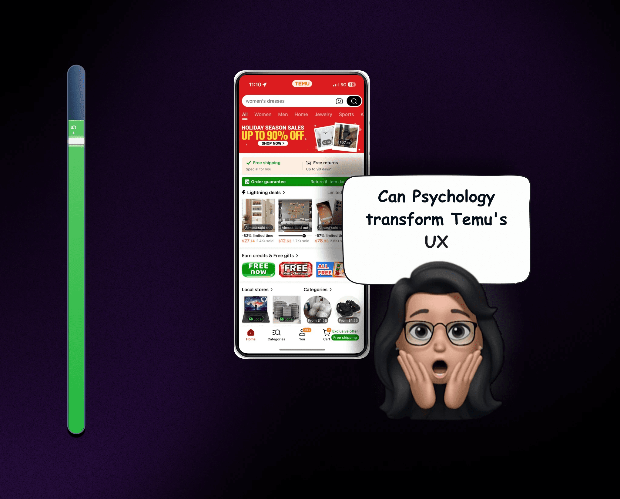
Transforming Temu: A Storyboard Journey
Enhancing Focus and Flow with Attention Models
Storyboarding • Psychology in HCI • E-Commerce
INDIA
Clunky returns → 30% faster, frustration-free 🚀
Revamping Amazon India’s Return Experience
E-Commerce • Design Sprint • Research
OTHER WORKS
INDIA
Can an app make loans hassle-free? Amazon Pay says YES!
Hassle-Free & Instant Personal Loan
FinTech • End to End Research & Design
INDIA
Clunky returns → 30% faster, frustration-free 🚀
Revamping Amazon India’s Return Experience
E-Commerce • Design Sprint • Research
COMING SOON!!
Transforming Temu: A Storyboard Journey
Enhancing Focus and Flow with Attention Models
Storyboarding • Psychology in HCI • E-Commerce
© Aishwarryabp2025
4:25 AM
Love what you see?
Let’s connect to create something meaningful!
© Aishwarryabp2025
4:25 AM